San Francisco
Salt Co.
Overview
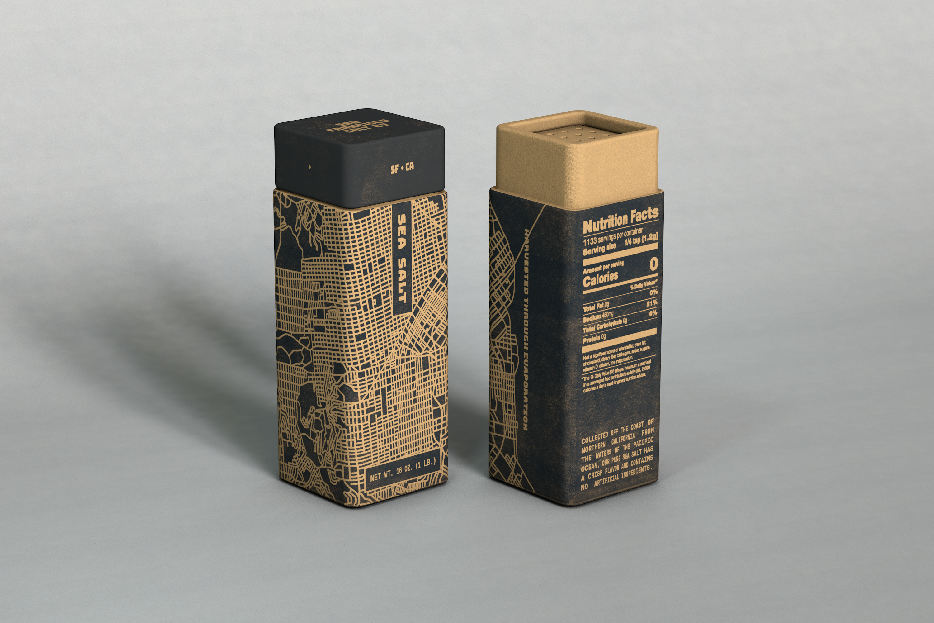
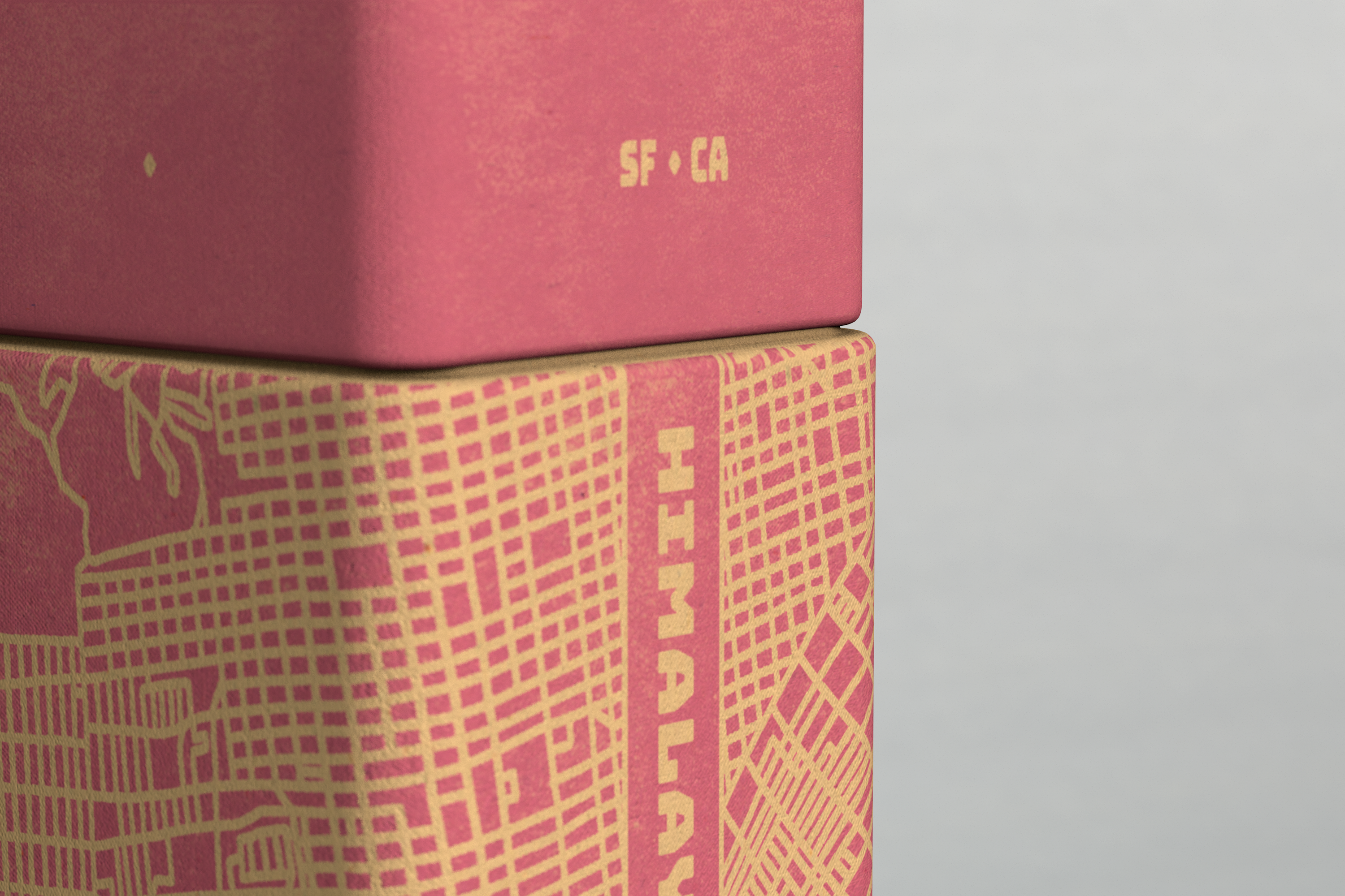
San Francisco Salt Co. crafts their products with ingredients carefully sourced from all over the world. They celebrate the international origins of their many flavors as well as the superior methods used to harvest the salts themselves. To visually represent the global nature of the product line, I drew inspiration from typography found on the hulls of cargo ships. The grid pattern of the San Francisco city layout honors the company's namesake and abstracts the angular, crystalline qualities of the salt itself.
2020